Background
Company: UPchieve
Role: UX Designer, Volunteer
This is a continuation of my previous healthcare case study and is focused specifically on the following design goal: Engage users to respond more quickly and frequently to coding RFIs. Achieving this goal will increase the rate and amount of money that’s collected for Zotec’s clients and itself.
The Problem
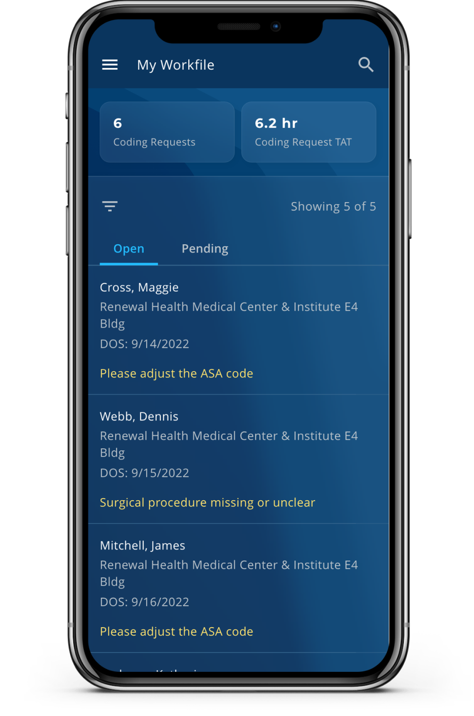
With the current Coding RFI tool, there is no content related to the user’s performance of responding to RFIs. And then there is the challenge of selecting the appropriate metrics and data visualizations to not just inform users but motivate them to perform the desired behavior.
Ideation + Iteration
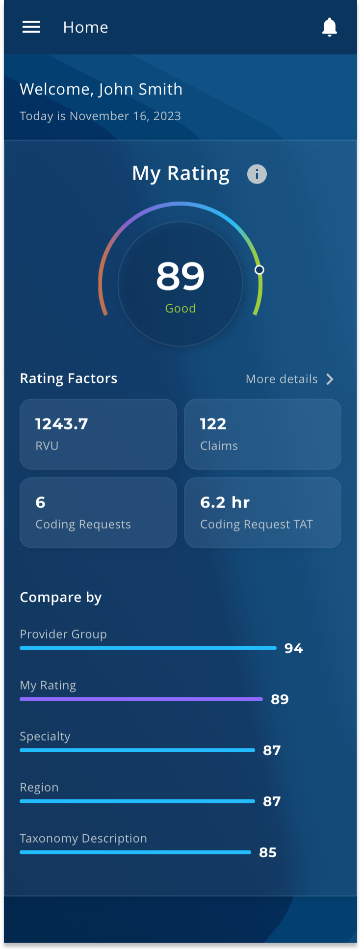
With our understanding of users - medical providers who are often on the go and administrators who are responsible for many doctors - we wanted to provide a single metric that could serve as a quick snapshot of their performance. This would be the “My Rating” based on a 0 - 100 scale. And then there would be a series of “Rating Factors” - additional metrics that determine this overall score, such as:
- # of open RFIs
- Turnaround time (TAT) of RFIs
- Relative Value Units (RVU), the value of medical services provided
- # of medical claims submitted
However, since “My Rating” is a unique Zotec metric, it needs more context to give it significance. From psychology, we don’t see values in absolutes but rather in terms of relation, e.g., something isn’t big or small but instead we understand it as being bigger or smaller than the other. Based on this, I designed a “Compare by” leaderboard-type data visualization that ranks the rating score against other dimensions. This serves to provide context to the rating score, allowing comparison to their peer group, location, etc. It also helps to nudge the user toward the desired behavior by creating competition and some tangible target for the user to aim towards.
Next Steps
While the Coding RFI tool has yet to be scheduled for development, we also know that there is more research to be done around this data visualization component of the tool. We need to gather more feedback on which “Rating Factors” are most relevant and how to present these details. We also want to validate assumptions around the “Compare by” leaderboard and how to further leverage data visuals in a way that will affect behavior change.